We’ve become an image-driven audience. Take a look at these stats compiled by Business2Community:
- Instagram, with it’s photo-driven focus, rules over other social media platforms in terms of engagement (58 times more per follower than Facebook, 120 times more than Twitter)
- Tweets with images received 150 percent more retweets
- Photo posts account for 87 percent of Facebook page engagements
According to a Christian Science Monitor article, graphic novels are one of the fastest growing areas in libraries. Is this really a surprise, when some 65 percent of the U.S. population is made up of visual learners (The Law Teacher, Vol.11)?
Of course, there’s the old adage: “A picture’s worth a thousand words.”
It seems that this math works for our world. Writing has been affected by such oogling; in particular, blogging reflects this highly visual culture.
In the past, magazines were the foreground of image-heavy writing. Think National Geographic and Life. These days, however, magazine text often veers more toward sections filled with blurbs accompanied by pithy graphics. Whole pages are filled with beautiful photos, accompanied by tiny captions that sketch in the story. Text length is shorter. Paragraph breaks occur more frequently. Formatting segments blocks of print to hold readers’s interest over longer articles. And images make or break that piece.
To quote Spinal Tap’s Nigel Tufnel, “We need that extra push over the cliff.”
Here’s a practical example of how taking images “to 11” plays out in blogging.
New Ways to Grab the Eye
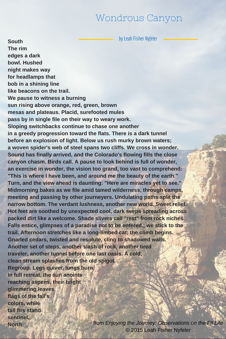
I’m going to start with the sexy stuff because if I bury it at the end, I’ll lose your interest. I used Canva — if you don’t know Canva, Google it now and get to creating! — to design a Pinterest-sized version of my poem, “Wondrous Canyon.” To create the Pinterest graphic, I selected a beautiful photo I’d taken from the south rim of the Grand Canyon to use as background. I faded the image just enough to be visible yet still read the print, which I layered on top and bolded.
The juxtaposition of actual image and figural content makes the poem more striking. And for those who might have missed the meaning of the construction, the visual helps with comprehension.
In other words, the image grabs your attention and encourages reading the poem, an activity that many people prefer only to going to the dentist.

Because I’m hoping that others will share my image poem, I added the blog title and copyright notice. I’ve constructed this article around the image, which has a handy “Pin it” button at the top. The extra time I’ve spent on creating the sexy image will, hopefully, bring readers to my site.
This was actually quite fun to create, and it took relatively little time (warning: there is a learning curve with Canva, so expect first pieces to take a fair amount of time to complete). The process satisfies a graphic itch that I didn’t know I had until I worked at a magazine. Bonus: those Canva-created graphics can be specially sized to fit the social media platform where you’ll be featuring them, so your image looks sharp and professional when shared.
The Better Blog Way
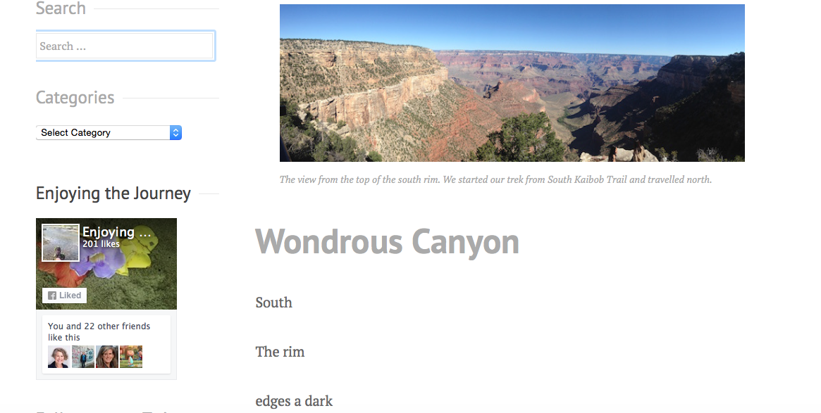
In my original blog post, I went the more traditional enlightened route. Most bloggers place some type of image into their text, and this is a pretty typical example. (I’d call it Ground Zero, the basic line of graphics for a successful blog.) And this worked for me — my post performed well.
I prefaced the poem with a short introduction. I used a heading to separate the poem from the intro. To break up text and provide a visual, I included two images, one to lead with the intro and one to close at the end of the poem, of the canyon. The main body of the blog post was the typed text of the poem.
You can take a look at that post here: “Crossing the Grand Canyon”

I then included those photos in tweets that linked to the post (be sure to shrink your URL in order to fit that image plus text into your 140-character allotment).
Old Style=Boring
When I first started writing online, my platform truly was a web log. I used my free LiveJournal account as a training diary, a way to connect with like-minded people who, in theory, would offer supportive comments on my Ironman workouts. That was in 2007, and for the technologically challenged, blogging wasn’t a user-friendly process. I lived in fear of deviating from simply typing in a lot of text. As a result, none of my early blogs contained helpful items, such as page breaks. Every now and then, I got fancy with colored text. Images? Forget about it.
After I got serious about blogging, I moved my content to WordPress, transferring those years of text-heavy posts. There’s a real line of demarcation between those 2007–2010 entries and what follows. Since attending BlogathonATX in Aug. 2015, I’ve even gone back through recent years to streamline tags/categories, eliminate distracting color highlights, better size photos, and standardize style.
As much as it pains me to leave this as it, here’s a look at a bare-bones post from the early days: “Is racing a horse I need to get back on?” See how many fixable items you can identify from my “to do” list, starting with the title.
Big Ticket Items for Updating Old Posts
- appropriately tag and categorize posts, so that content is relevant and accessible today
- correct stylistic issues and update formatting
- add images
The quickest fix is tagging. This streamlines my site and makes it more attractive from an SEO standpoint. As an editor, I can’t stand the various irregularities in style and usage, so those fall next on the “to do” list. I get to adding images last. Why, given the importance I’ve demonstrated in having visual components to successful online writing? The simple answer: back-adding relevant, quality images is time consuming.
The take-away from my practical example? Spend time upfront on quality images for blog posts. You will not regret the extra work that could bring additional eyes to your craft.


